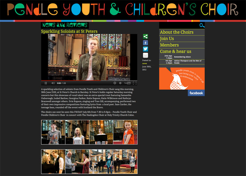
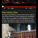
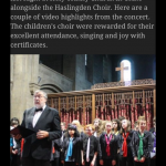
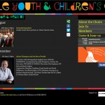
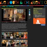
The original Pendle Youth Choir website was an early attempt at a wordpress theme, and I’ve wanted to tweak and change it ever since. Recent decisions about the choir’s logo and promotion of the children’s choir on par with the youth choir gave me the opportunity of a revamp. AC Telfer and I had recently taken some good photos and video of the choir in action, so everything was in place to give the site a makeover. As with most sites I’m working on at the moment, Pende Youth Choir uses twitter’s bootstrap as a foundation. This means the site has a responsive layout, which adapts to the browser window. Elements like the logo and search bar are swapped out on mobile devices: the logo is replaced for a version that works on two lines and the search gets repositioned to stay with the rest of the navigation.
The new Pendle Youth Choir logo works well on a white or black background. For the website I went for a dark background, it really lets the colours sing out and the new video content sits well on black. The choir’s calendar is now split between public performances, in the sidebar and on the diary page, and information for members. I’d previously used an events plug in, but now I’m using bespoke code and custom post types for more control.
