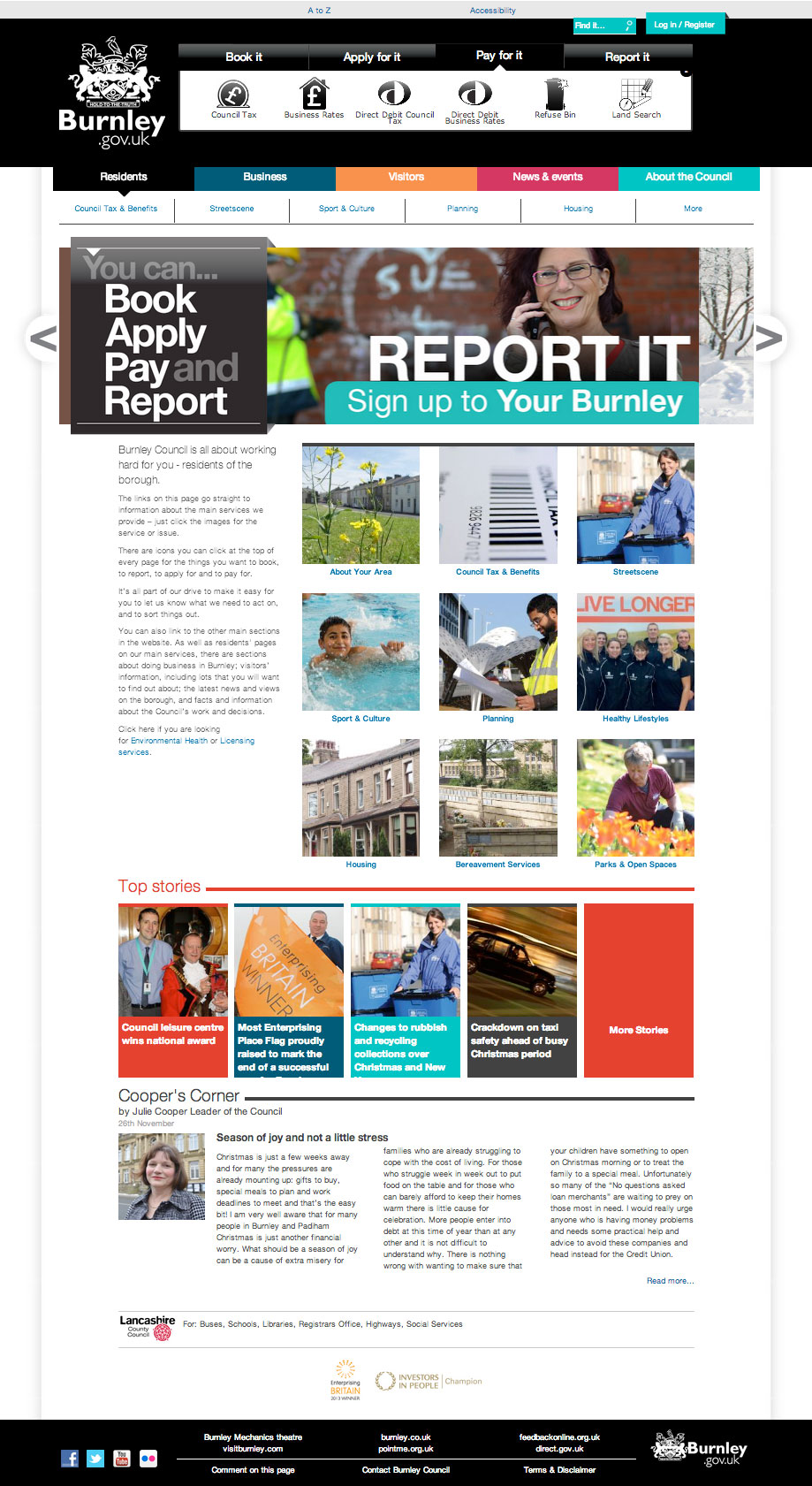
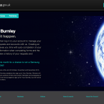
burnley.gov.uk is the main website for Burnley Council, where I work as part of the Graphics team. We’d always wanted to play a greater part in the design of the site and over the past 10 years or so had been frustrated in this ambition, until 2013 when a move away from a proprietary platform allowed us the chance to work, alongside the Council’s IT and Communications departments, to create the current website.
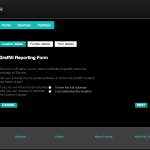
With many in-house users providing content, and a new content management platform to get to grips with, this was a challenging and high profile project. The site also incorporates self serve pages which required their own styling.
We worked hard to incorporate photography into the main navigation as well as come up with a suite of icons for the book it, apply for it section in the header. The use of photography adds a human element to what could be a dry, information only site, it is important that the site is approachable and friendly as well as easy to navigate and useful.
A site like this holds a mass of information; indeed an organisation like this is a mass of information that can be ordered and re-ordered in numerous combinations. A large part of the task of designing burnley.gov.uk was to come up with a structure that could be agreed upon throughout the organisation and make sense to the public. There are five main sections, catering for the main users of the site (residents and businesses), visitors, news, and council ‘stuff’ like councillors and ward information etc. Additionally there was a need to push the self serve pages, where residents can Apply, Book, Pay and Report. Links to this appear not only in the header but also as a sleeve over the top of the advertising carousel, giving it constant prominence over anything else we might be promoting at the time.
What did we do?
It’s tricky to narrow down who did what in a project like this. The graphics unit suggested a structure for the site as well as devising the look and feel of it. Once agreed we provided all the css for the site as well as javascript for drop downs and other interactive tweaks. We also helped with custom content creation and queries to display information such as the councillor information pages.
