At last, we get to the meat of Twitter’s Bootstrap. The whole point is, after all, to have a nice clean CSS framework to work with. Back in the mists of internet time we had to design with tables and, though I’ve no desire to go back to that, it did provide a common way of setting up rows and columns, the fundamental underpinning of any design. I think if the web were being set up from scratch today it would feature CSS rows and columns, and that’s why we need a scaffold.
The basic bootstrap structure of divs goes like this:
container
row
span*
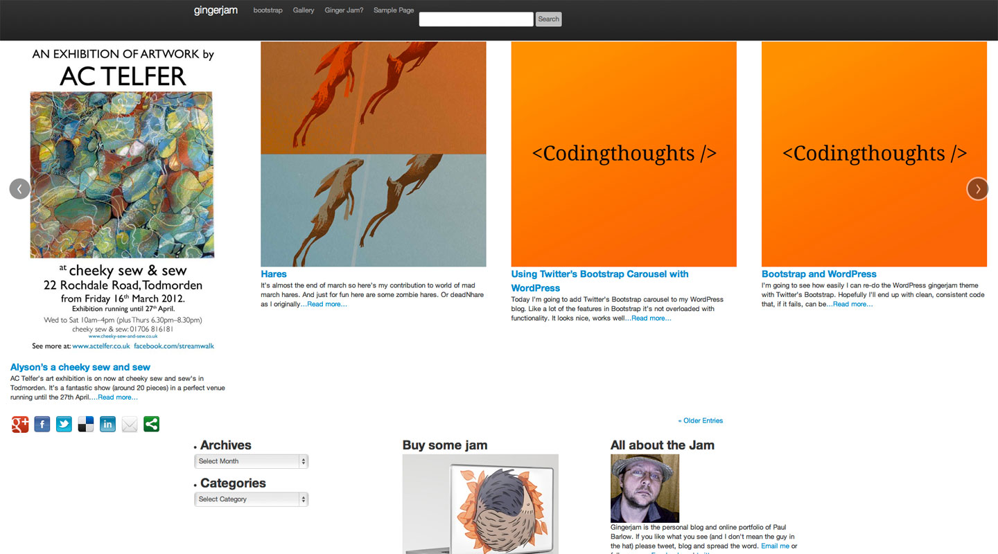
The row is divisible by twelve columns and the span class is followed by a number, eg span4 gives you a a div of 4 column widths. There’s a clear explanation on twitter’s bootstrap website For the footer of gingerjam I need a flexible width bar containing my social network buttons and post navigation and then a fixed width area below that with three columns containing info about the site and links to my shop on society six.
The flexible bar is easy, just add ‘-fluid’ to the container and row class names. Then it’s just two divs inside that with a class of span6 each to create two columns. I’m adding social buttons from sharethis.com which fits my ‘not reinventing the wheel’ approach to this refit. The second span6 gets the standard WordPress posts navigation which will take us from one set of twelve posts to the next (not functioning properly on the example posted here, as it has to function as part of the existing theme).
My info columns are a straightforward implementation of container, row and three lots of span4 divs. I’m placing a mixture of hard coded content and dynamic sidebars for widgets in these columns. And that’s it. Check out the sample page here, have a look at the code. It’s not complex. Provided you have a clear idea of the design you’re after before you start and can envision that as a series of rows and columns you can quickly knit it together with bootstrap.
Here’s what it looks like with no additional styling other than the base bootstrap.css:
I’ve added some ids to the row divs so I can add some CSS styling to them. More on that next time… The example page has some basic styling on, take a look.

