Daughter has been working on a script based on the tv series Angel, its called Angel Education. She imagines a spin off series where the vampire with a soul opens a school for young demons and witches.
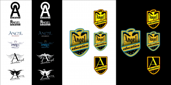
Always keen to encourage her literary ambitions I have come up a with some logo ideas for the show.
My first choice is a pretty smart looking, clean logo. It’s the sort of thing I’d come up with if I were actually asked to produce a logo for a demonic school. The kind of demonic school that wants to look modern and attract the right kind of demon pupil.
It’s got a nice big, educational kind of A, the sort you mind find in an ABC book, plus halo and horns – but it stil looks business-like and serious. I think this is the one Angel would choose.
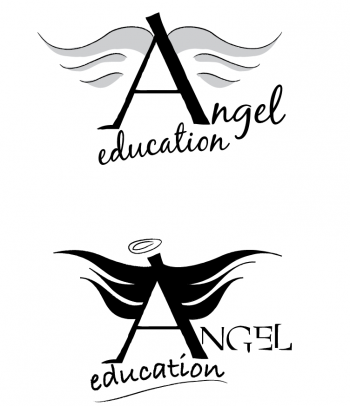
The next couple on the sheet incorporate the Angel typography from the original series.
But I really wanted to do something that might feature in the story, rather than on the opening credits. That’s why all the following ideas are NOT my best attempt at design. I wanted to re-capture the feel of Angel’s business cards that Cordelia designed. A lot of the humour in the series came from Angel being over-ruled and I think the logo that the school board chooses would probably anger or annoy him, but he’d be powerless to prevent them.
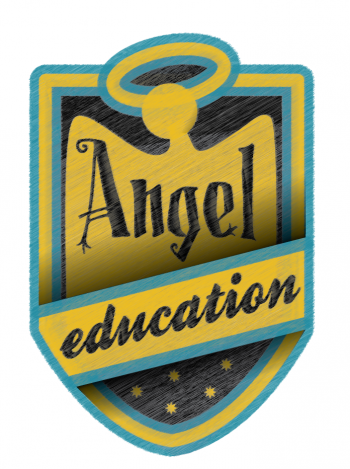
And then the young people will need uniforms. So I’ve designed a badge. It really needs some latin phrase to round it. Something like, “we excel at decapitation” but in latin.
Oh – what do you know – there’s a website for that – Nos excellunt in DECOLLATIO. I’ll add that to the next draft.
The winning design is below. The sort of logo you might get if you get the kids involved in the process. Angel would hate it. The original wouldn’t have the horns on – but imagine in the back of shot gangs of teens adding horns to the logo faster than the demon janitor can clean them off.
Do I have to point out that my daughter is still at school as has no links with Fox Media and Angel Education is not a real show?

