Now this is a bit of an oddity. Angel Falls is a detail from a larger project, the beginnings of which you can see right here.
The brief was to come up with a label for imaginary bottled water company Angel Falls. Within the narrative the company brand had be old fashioned, and more than a bit sexist. The label needed to be low tech, hand drawn, and a bit tacky. I’d love to have real briefs like this.
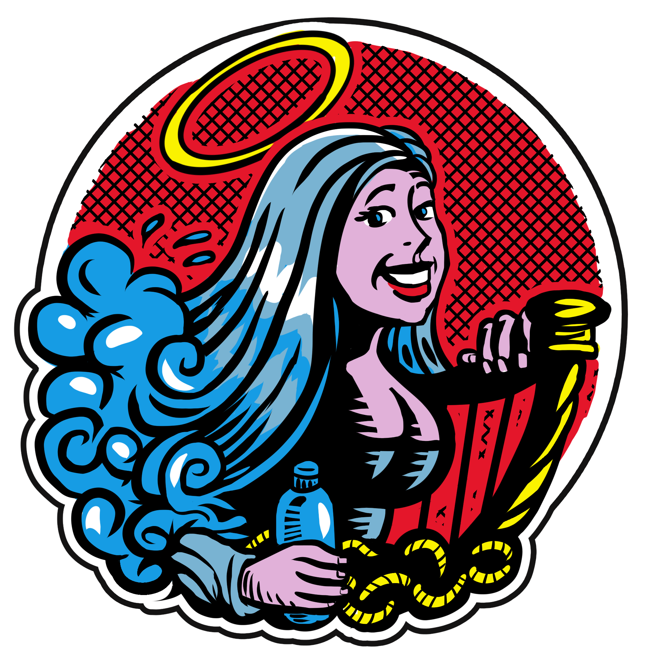
In the end I spent a ridiculous amount of time on this illustration, considering that in the final comic it will be a tiny detail – a fact that means that this illustration is far too complex when reduced. I’ve since done a much simpler one for final use.