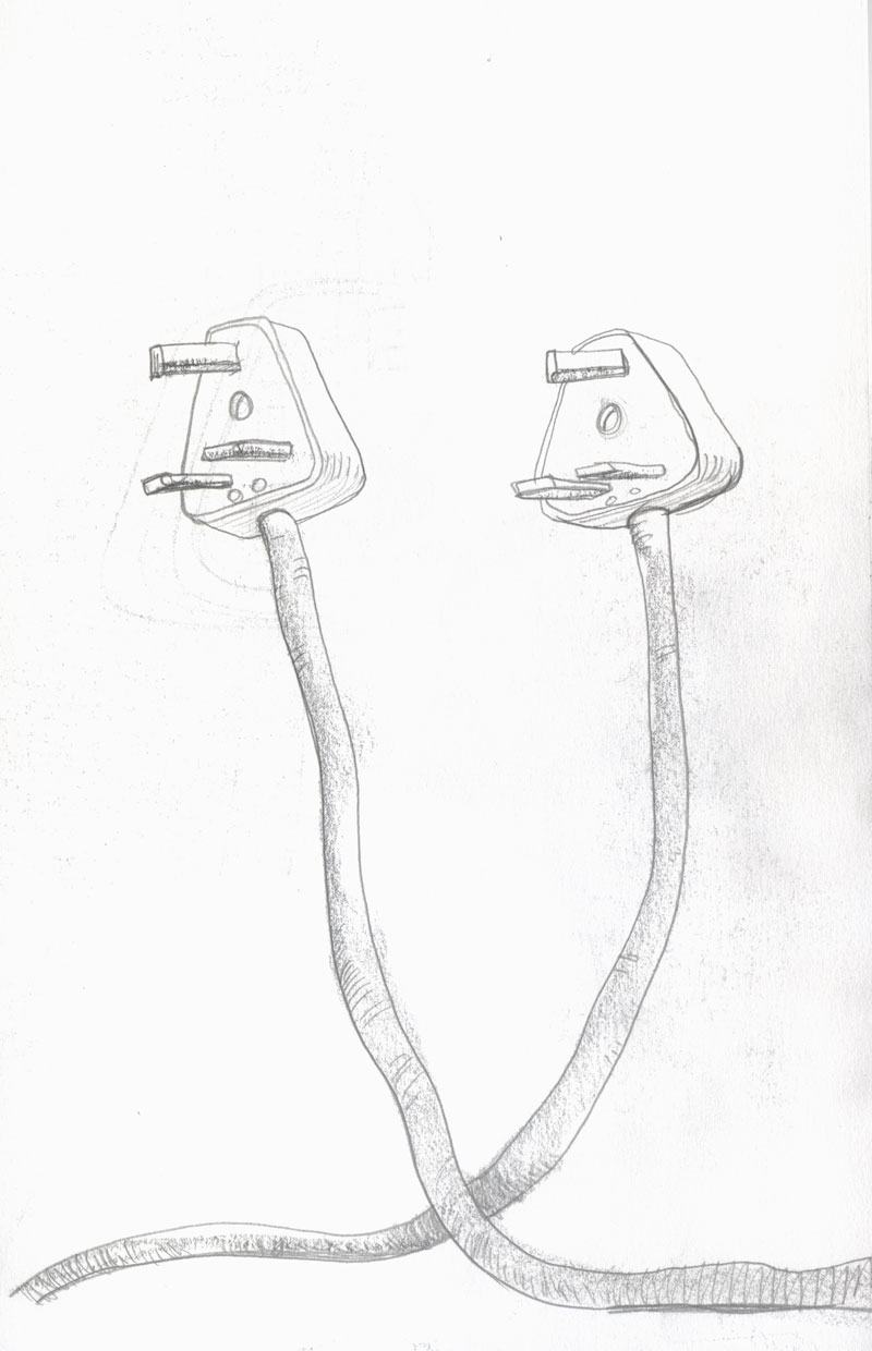
Council’s have a reputation for plugging health and safety. We’re no different at Burnley and I’m currently mid-way through a set of posters highlighting the hazards of trips and slips and what have you. One of the posters will be about electrical safety, and this is a spare drawing from my initial concepts which doesn’t fit stylistically with the rest of the suite. I found it interesting none-the-less and have worked it up as another curio for gingerjam.
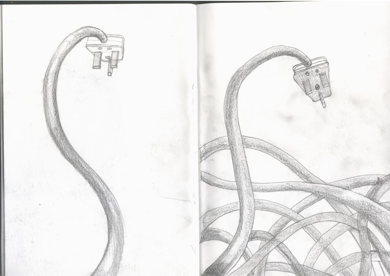
As is often the case, I’m a little torn between the energy and texture of the original drawing and the flat polished look of the final illustrator file. There are those, including the wonderful AC Telfer, who would encourage me to paint, charcoal, or pastel my way to the final solution.
Listen.
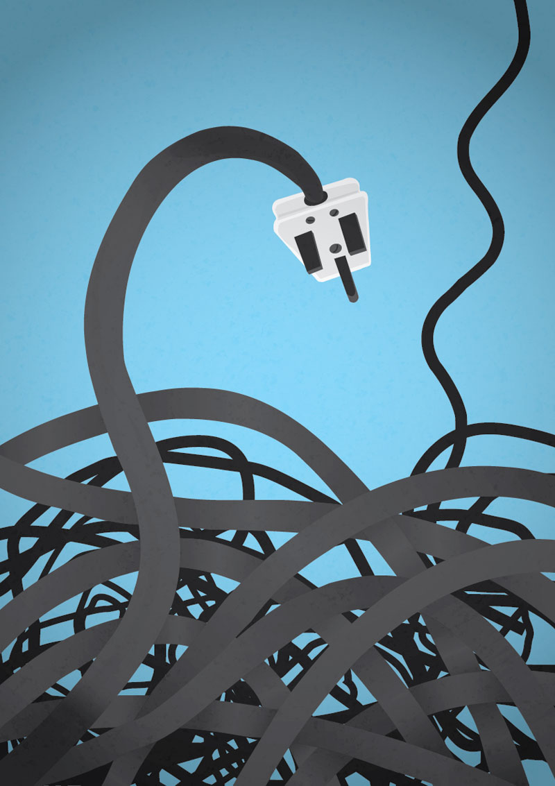
When I was at college we had a print maker who was immaculate in dress, very well manicured and not a hair out of place. He wore pastel coloured jumpers, white shirts and lightly patterned ties. I was in awe of this man. I can’t even walk in a print room without getting covered in ink. I’m a very messy person. If someone hadn’t invented the apple mac I would never have made a single piece of print ready artwork that wasn’t covered in thumb prints, smudges and god knows what. So here we are, another tidy looking piece of artwork. God bless digital.