Just a quick and dirty sketch. Did this a while back, found it today and liked it…


At last, we get to the meat of Twitter’s Bootstrap. The whole point is, after all, to have a nice clean CSS framework to work with. Back in the mists of internet time we had to design with tables and, though I’ve no desire to go back to that, it did provide a common way of setting up rows and columns, the fundamental underpinning of any design. I think if the web were being set up from scratch today it would feature CSS rows and columns, and that’s why we need a scaffold.
The basic bootstrap structure of divs goes like this:
container
row
span*
The row is divisible by twelve columns and the span class is followed by a number, eg span4 gives you a a div of 4 column widths. There’s a clear explanation on twitter’s bootstrap website For the footer of gingerjam I need a flexible width bar containing my social network buttons and post navigation and then a fixed width area below that with three columns containing info about the site and links to my shop on society six.
The flexible bar is easy, just add ‘-fluid’ to the container and row class names. Then it’s just two divs inside that with a class of span6 each to create two columns. I’m adding social buttons from sharethis.com which fits my ‘not reinventing the wheel’ approach to this refit. The second span6 gets the standard WordPress posts navigation which will take us from one set of twelve posts to the next (not functioning properly on the example posted here, as it has to function as part of the existing theme).
My info columns are a straightforward implementation of container, row and three lots of span4 divs. I’m placing a mixture of hard coded content and dynamic sidebars for widgets in these columns. And that’s it. Check out the sample page here, have a look at the code. It’s not complex. Provided you have a clear idea of the design you’re after before you start and can envision that as a series of rows and columns you can quickly knit it together with bootstrap.
Here’s what it looks like with no additional styling other than the base bootstrap.css:

I’ve added some ids to the row divs so I can add some CSS styling to them. More on that next time… The example page has some basic styling on, take a look.
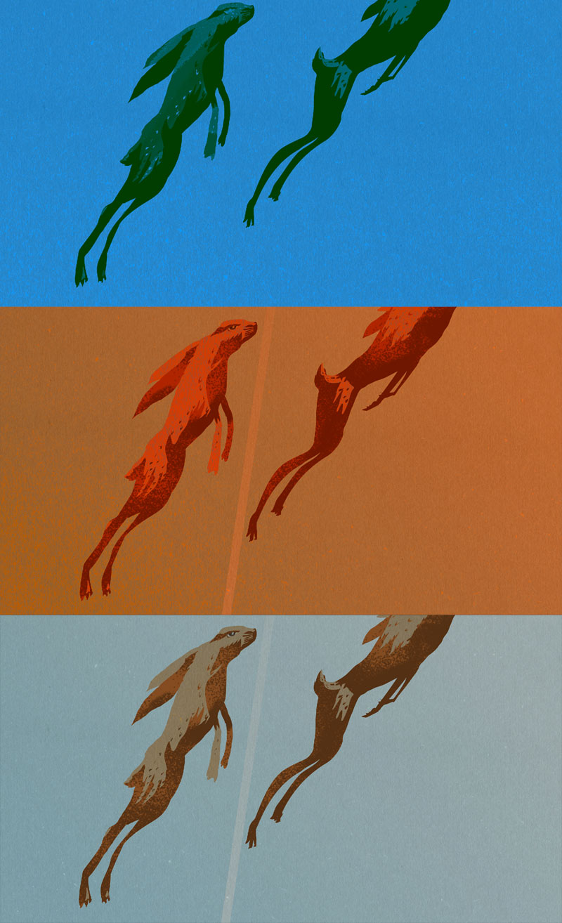
It’s almost the end of March so here’s my contribution to world of Mad March Hares.
And just for fun here are some zombie hares. Or deadNhare as I originally called it.
All these hares were produced for the March Artists’ Hangout.

Today I’m going to add Twitter’s Bootstrap carousel to my WordPress blog. Like a lot of the features in Bootstrap it’s not overloaded with functionality. It looks nice, works well and is easy to implement.
For gingerjam I want the carousel to contain my latest 12 posts in groups of four. This is the central feature of my home page. By using Bootstrap’s grid and the carousel I’ll be able to have four posts at a time on show that will scale no matter how large the viewport gets. If you want to do something similar make sure you’ve added bootstrap css and javascript to your page like this.
First I set up the grid. Normally the carousel would be inside a column or row but I want it to stretch from one side of the screen to the other so my container and row divs are inside the carousel. Both the container and row divs are fluid, wich in Bootstrap is as easy as using the classes .container-fluid and .row-fluid.
Each ‘slide’ in the Bootstrap carousel is a div with the class of .item and in each of those I’ll place four columns, each with a class of .span3. Closing divs are going to be provided by a bit of php logic, since on every fourth post we need to close the item and start a new one and on the twelfth post we close the item and stop. I keep track of the number of loops with a variable called $count which increments by one on each loop. $count is tested to see if it equals 12 or is divisible by 4. $count is also used in an if statement at the start of the loop to apply the .active class to first item.
Here’s the complete code for the carousel.
[cc lang=’php’ ]
[/cc]

On the present version of bootstrap images don’t scale. So in my style.css I’m adding img{max-width:100%;}. I’ve also got some vimeo embedded in some posts so I’ll amend that to
[cc lang=’css’ ]
img, object{
max-width: 100%;
}
[/cc]
Also the carousel doesn’t currently work in internet explorer without the additional class of .slide.
Ok – I hope that’s useful I’ve not really published a tutorial before, so go easy on me if it doesn’t work! Next time I’ll explore the grid a bit more with the footer of the page and start colouring it in with the gingerjam colour scheme and typography. In the meantime take a look for yourself…