Latest Jam

  • Work Inspiration Day

    Work Inspiration Day

    Burnley College hosted a Work Inspiration Day for children from five local schools to come and have a look at what the world of work might offer them.

    I was very pleased to be asked to attend and try and inspire some young folks to do graphic design.

    You can read more about the event and the creation of this video on creative-council.net

  • Lost

    Lost

    Lost is an illustration for a poem by Ian Longstaff. We’ve submitted this piece to cardboard collective.

    Here’s a few variations on the theme. Ian’s poem is full of visual metaphor already, so I was anxious that my illustration didn’t just represent one of those existing ideas. Hopefully my solution has added a little to the piece as well as providing some atmsophere.

    Ian’s poem:

    LOST

    You know when you’re driving
    and you arrive somewhere
    and then can’t remember
    how you got there…?

    That’s how I feel now about LIVING.

    How did I miss all the signposts the warnings
    the flashing lights?

    What am I doing on auto-pilot
    on the road to Nowhere City?

    And how did I end up towing all this baggage?
    Half of it’s not mine, I swear!
    I reckon it was planted on me
    by bent cops from the emotional police

    Then there was that guy chasing after me
    I drove faster, thinking he was mad

    It wasn’t until he pulled alongside
    that I realised who he was…

    He was me.

    And all the while he’d been trying to tell me
    that we were on the wrong road.


    The final piece will feature the poem as part of the illustration.

  • WordPress toolbox

    WordPress toolbox

    Here’s a collection of online resources and tools that I’ve used recently when developing WordPress Templates. Don’t leave home without your WordPress toolbox, even if you’re working from home; in your jammies.

    Bootstrap 3

    Super flexible and useful CSS framework, mobile friendly and full of extra goodies.

    jQuery

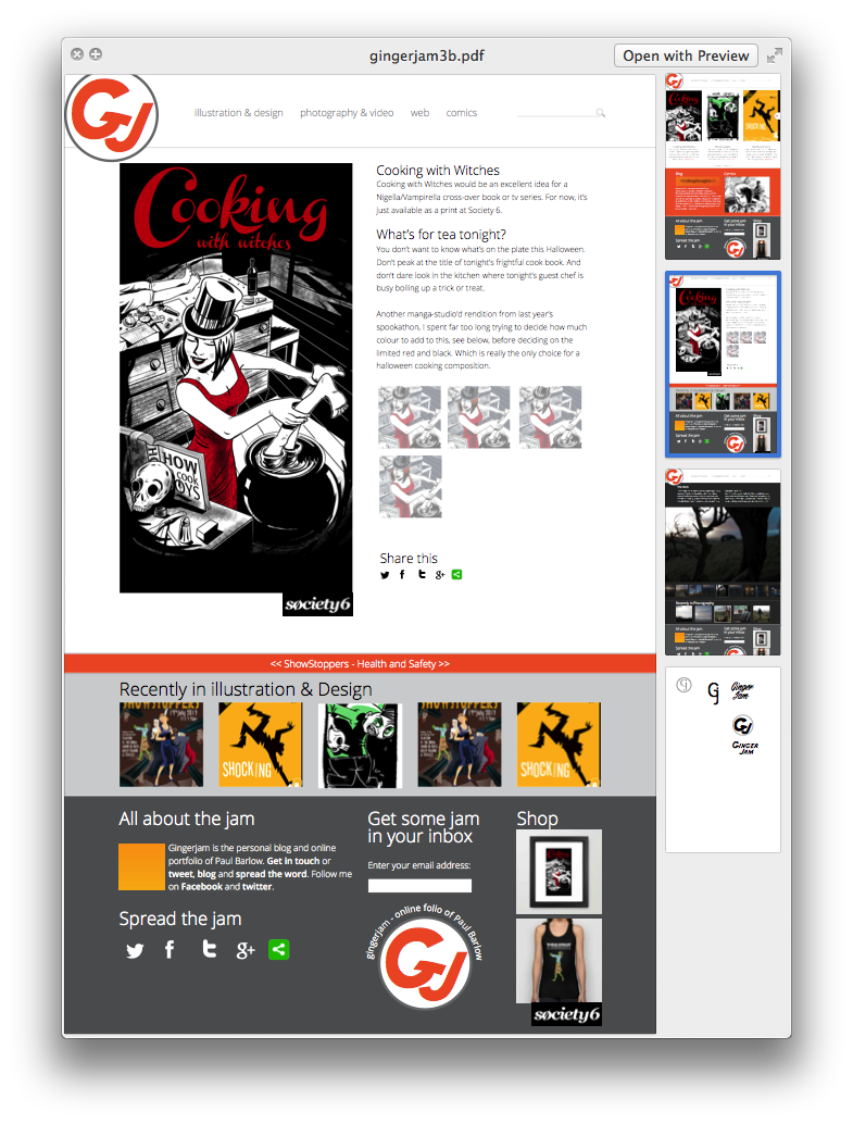
    You need this for a lot of the Bootstrap goodies, like the carousel. But it can do so much more. Like move all your content around, after it’s loaded and hide and show it with pretty animations. Like on one of my photography pages.

    GenerateWP

    I love this. It can save a bag of time if, like me, you know what your wordpress query should look like and how it will work but are liable to bugger up the query by leaving out a semi-colon.

    CSS3 Generator

    This is really useful for the more obscure bits of CSS, like RGBA, fontface and outlines.

    Of course most of the CSS I generate is via my favourite code editor…

    Espresso

    Simple. I’d much rather hand code in Espresso than go anywhere near Dreamweaver. Sorry Adobe. I love inDesign, but Dreamweaver feels so bloaty in comparison to Espresso’s stripped down interface.

    inDesign

    ‘cos that’s where the design comes together after the beer mat and sketchbook phase. If you follow that link you’ll be many versions ahead of me though…

    Stack overflow

    It’s where all the knowledge that isn’t in your head is kept. Honestly, if I’m a googling a bit of code, be it wordpress, php or jquery, the best answer is usually on this site.

    That’s my WordPress Toolbox…

    No doubt I’ve forgotten something. I’d love to know what tools other people are using too. Drop me a comment.

  • Bootstrap 3

    Bootstrap 3

    I like to give the site a bit of a facelift every year. It gives me a chance to review how stuff is going and to experiment with new techniques. Last year I used Twitter’s bootstrap to provide grids and structure, and I’ve bootstrapped everything since. This time around I’ve used Bootstrap 3, which I’d been putting off for a while because I could see I’d have to learn some new stuff.

    Now, I rather like learning, but in a production environment I could do without using multiple syntaxes all at once. That’s one of the reasons for using a CSS framework, after all – it provides a common language. So I can shout across the table, “it’s a col3 offset4,” or some such. Before using a css framework you may come to the same solution many times but call it whatever makes sense that day.

    Bootstrap 3 changes the column names for its grid. That’s the last thing I wanted. Why would you want to do that?

    To make it better, obviously.

    Now I can give a column multiple class names. So on a big screen an element might be 3 columns, then on a phone it could be 6 columns. Or 1. Or 4. Or even stay at 3 columns. With the old system it would auto snap to full width (12 columns), which is mostly what you’d want it to do. But quite often not what you wanted at all.

    Bootstrap 3 grids in action

    This is perfect for something like a row of icons. On a big screen you might want them to be no wider than one column. On a phone that’s too small but now I can specify for extra small devices that each be 2 columns, or 4, or 6.

    So now I have to shout across the room, “it’s a col-lg-1 col-lg-offset-1 col-md-2 col-xs-3.” Which is not nearly so snappy. But its much more flexible…